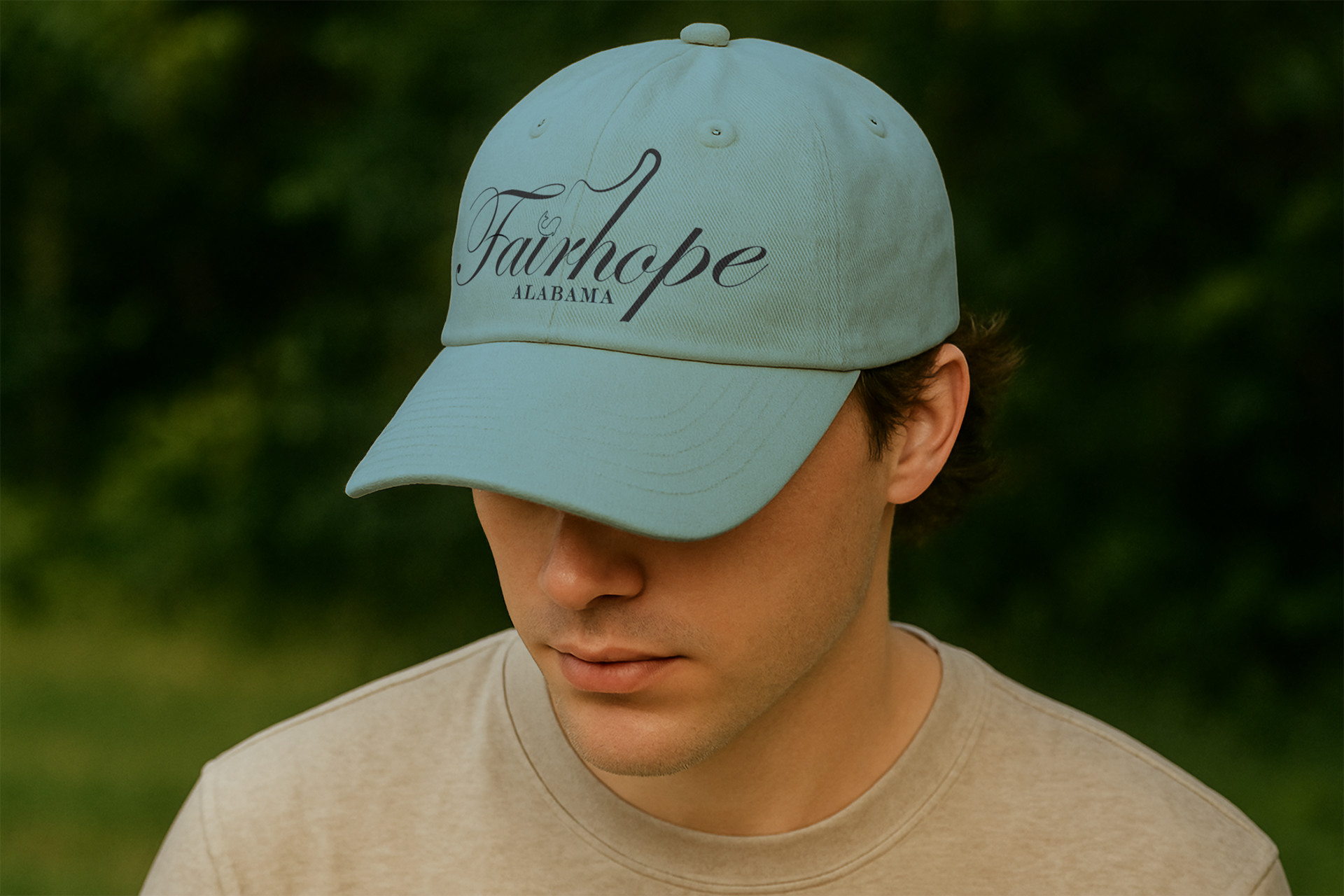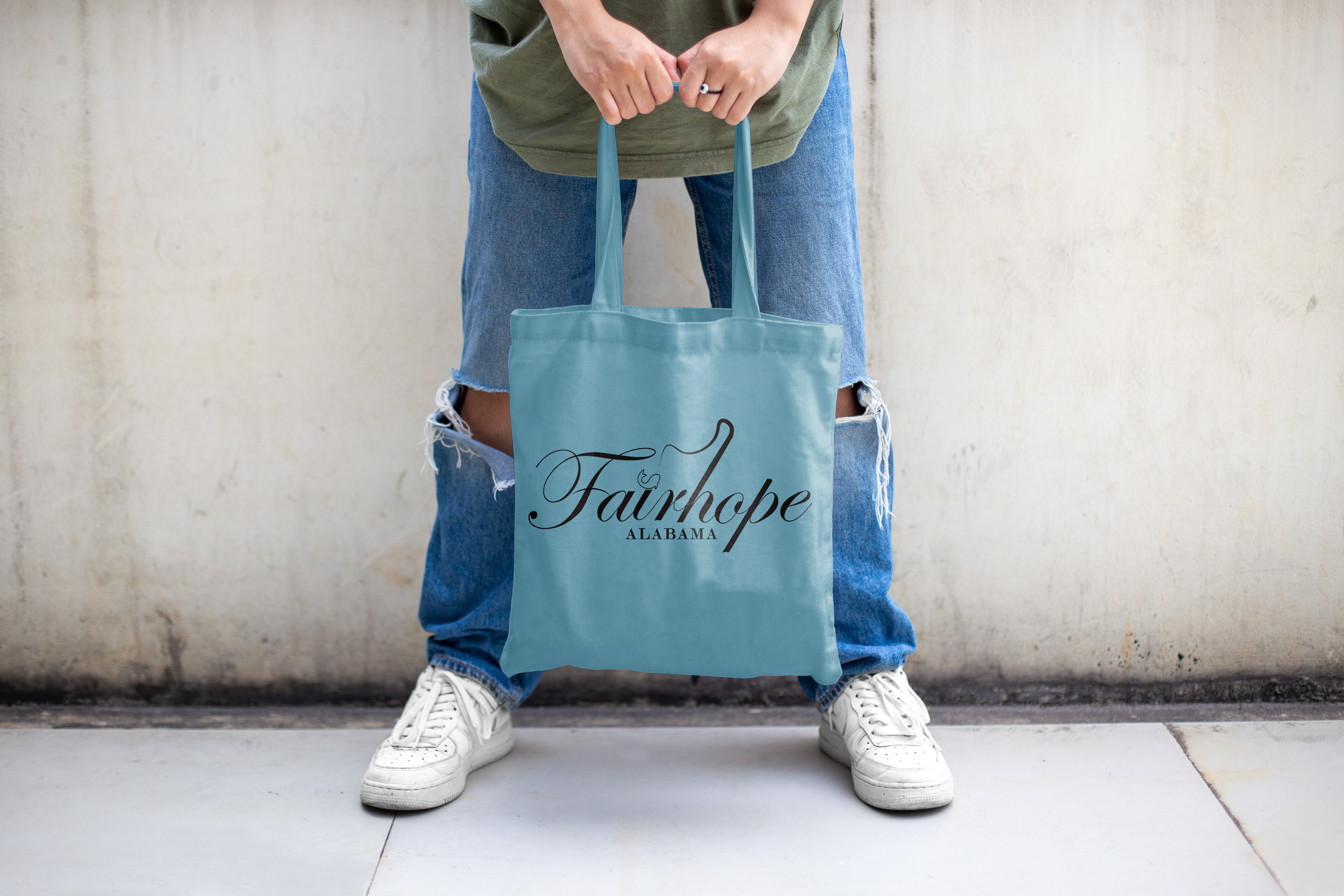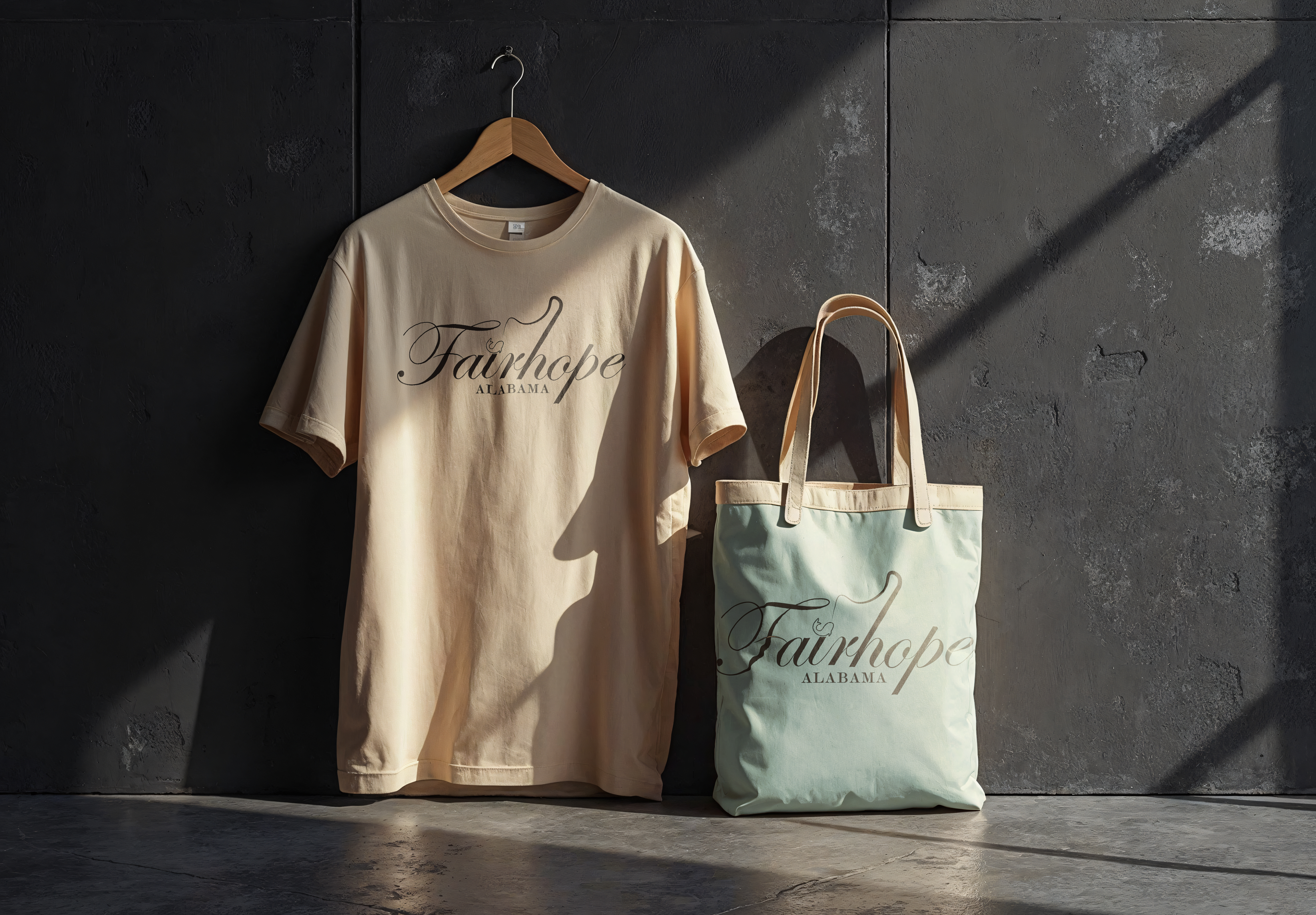
Project Overview:The identity pairs a customized script with a grounded serif to reflect Fairhope’s balance of artistry and heritage. The hand‑modified lettering brings in the fluid motion of the coast, while the supporting type adds clarity and structure. A palette of soft coastal blues reinforces the town’s calm, shoreline atmosphere, and the integrated fishing motif nods to Fairhope’s deep connection to the bay.